Yahoo Search is a daily destination for millions, yet its visual language was a mosaic of legacy tech debt and fragmented vertical designs. As the lead designer, I orchestrated a top-to-bottom architectural refresh of the search result page.
The goal was to transform a desktop-centric, hardcoded legacy system into a mobile-first, token-based design system that improves user trust through perceived quality. By the end of the project, we had collapsed implementation time from months to days and launched over twenty search page features in record time.
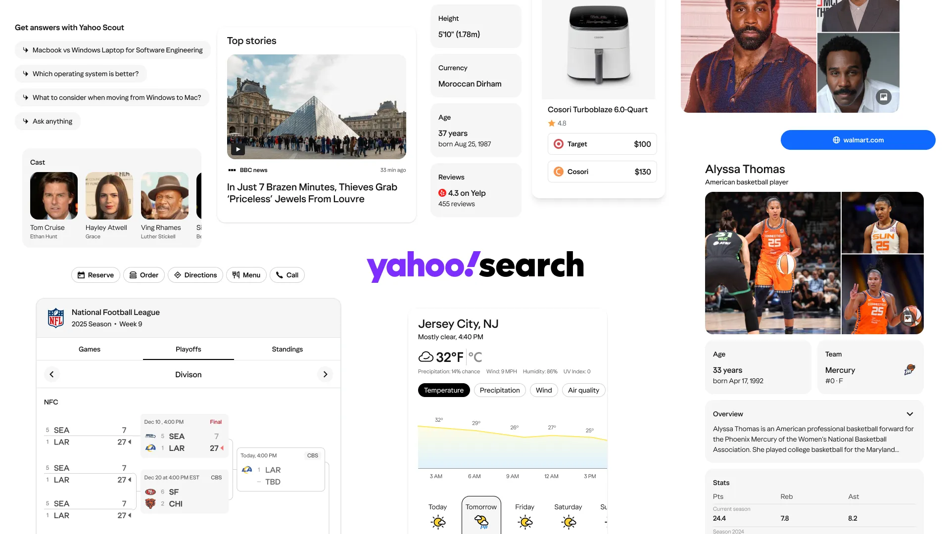
Strategic challenge
Our production environment suffered from years of style drift where eight different verticals were building in silos. This fragmentation was a design problem and an engineering bottleneck. Hardcoded styles made even small visual updates risky and slow. The existing component library had drifted so far from production that, as one teammate put it, it was “more of a reference than a design system.”
More importantly, our user research confirmed that users view visual polish as a direct proxy for search result quality. Our desktop-first legacy was eroding trust on mobile, making a modernization of both the front-end stack and the design language a business necessity.
The legacy mobile layout offered poor hierarchy and stuffed everything into the page. Select a numbered marker to see what changed.
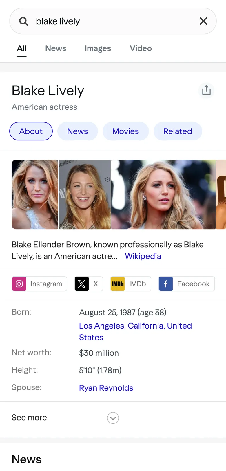
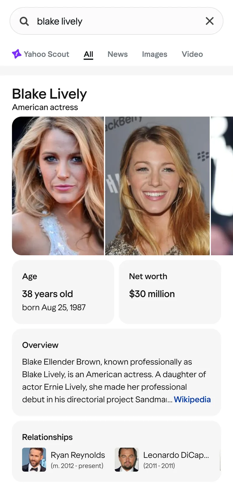
Select a numbered marker to see what changed.
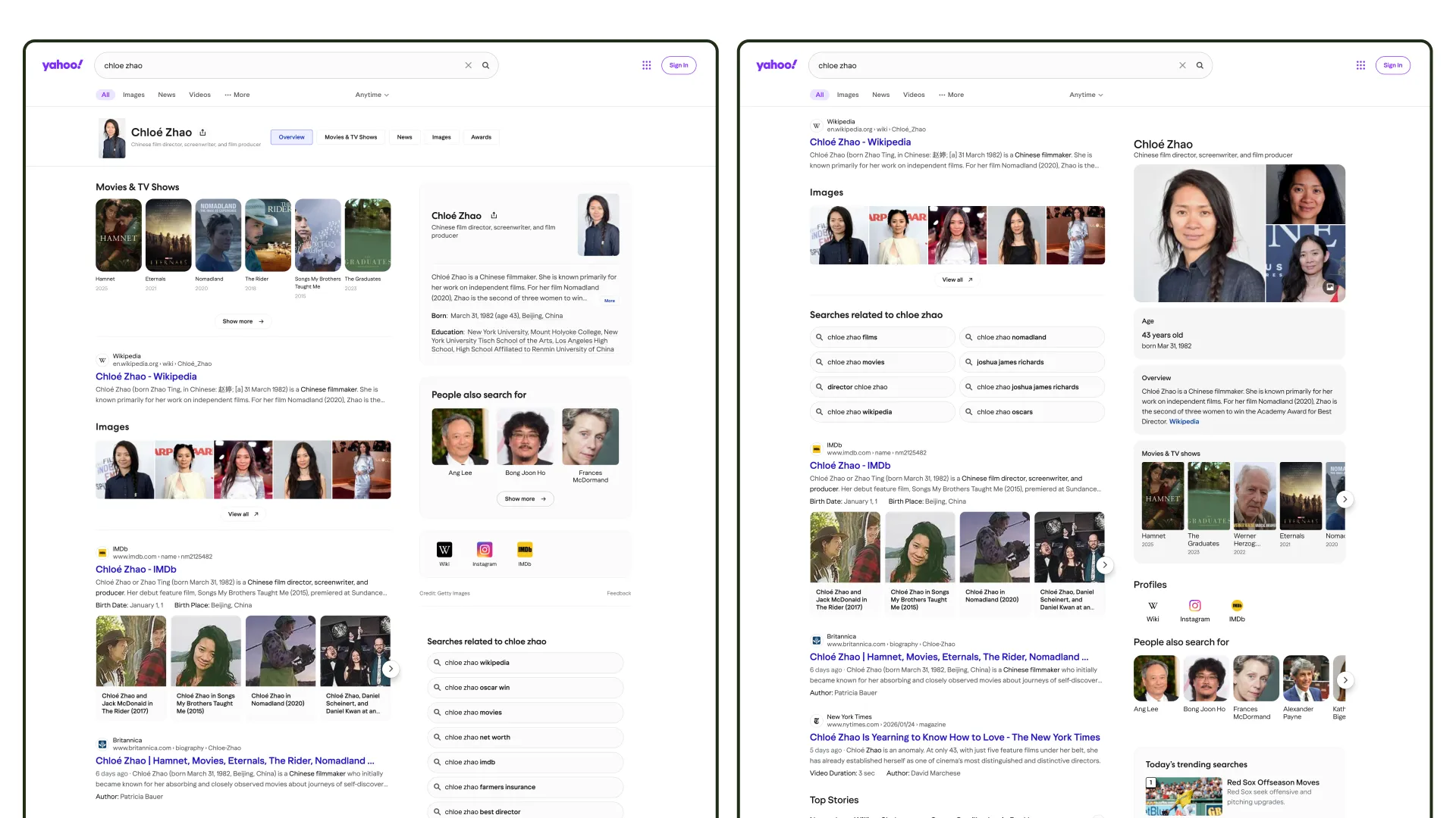
Here’s another side-by-side of the desktop experience.
Leadership and orchestration
At the principal level, my role focused on architecting the way our teams worked together. I led a multi-disciplinary squad consisting of five designers, a researcher, and a content designer. To move quickly, we adopted a hub-and-spoke governance model. Each designer owned a set of verticals – navigational, news, entities, sports, local – and built components for their specific needs, but contributed them back to a shared library for universal use. Cutting across all of them was a horizontal layer of shared foundations and page architecture. I owned that layer alongside the entities and sports verticals.
I partnered closely with the VP of Product and Director of Engineering to ensure this design system launch coincided with a migration to a modern front-end stack, aligning our visual goals with technical velocity.
Navigating the system and brand trade-off
A key leadership challenge arose with the AI summary vertical. Stakeholders wanted high-impact branding for this feature to ensure it retained prominence and felt distinct from standard search results – potentially undermining our disciplined approach. I negotiated a specialized visual treatment for this vertical to maintain its brand equity while ensuring the underlying token architecture for typography and spacing still adhered to the framework. This preserved overall cohesion without blocking the innovation required for our newest features.
Principles
We had to describe a vision and begin to execute. These were the principles our cross-functional group sketched out early on. Each came with a question we could evaluate designs against.
- Modernize through clarity. Does this look and feel like a modern, top-tier search product?
- Hierarchy follows user intent. Can the user grasp the information they need or identify their next action in two to three seconds?
- Predictable actions and affordances. Does the user understand what they can do and where that action will take them?
- Coherence enables speed. How much time would be spent building a new component?
The craft of systems
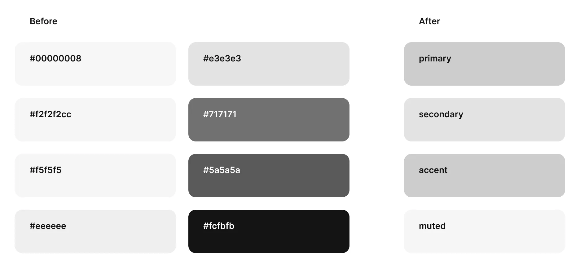
Visual design at this scale is an exercise in editing. We moved from a collection of random styles to a strict, principle-based language. We successfully consolidated twelve disparate button styles down to five core variants and reduced a fragmented gray palette of over ten shades to four core neutral tokens.
This wasn’t just about aesthetics; we replaced fifteen different guided search carousels with a single adaptive component. This level of consolidation allowed us to use a common Yahoo design token library to bridge the gap between Figma and the new front-end stack.
Validating perceived quality
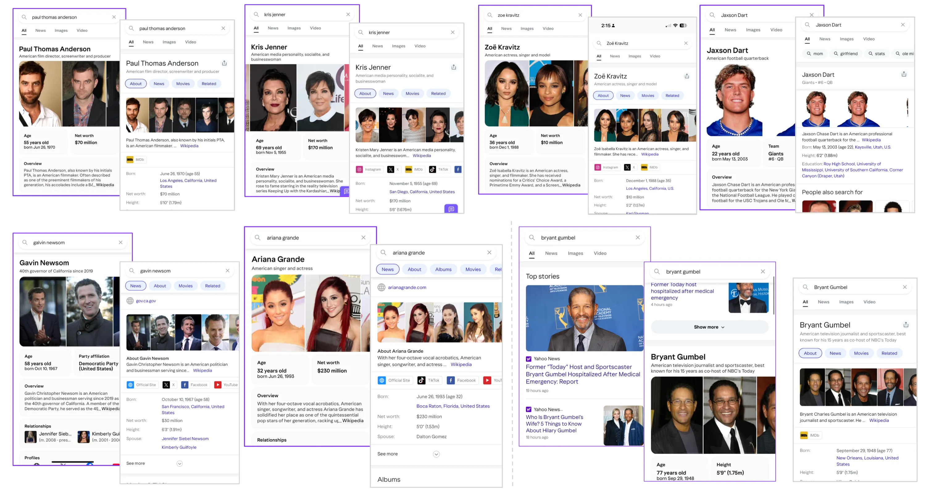
Our qualitative user research showed a clear preference for the new design. Across eight people-search tasks, participants rated the redesign higher on nearly all of them, and 75% preferred it overall. Users noted that the cleaner interface and improved hierarchy made the search results feel more “trustworthy” and “professional.” This validated our initial hypothesis that visual craft is inextricably linked to the user’s perception of search quality.
[The redesigned] version feels better and cleaner to me. I believe it more because it feels more put together.
— UXR participant
I just liked the format of [the redesigned] page more. It’s more organized with the modular box. It was cleaner. I didn’t have to look quite as hard even though, like, the difference is honestly really negligible.
— UXR participant
I searched for Zoe Kravitz and there was a section that clearly stated all of her past relationships. Whereas in the other one, I felt like I had to do a bit more searching.
— UXR participant
Qualitatively better, quantitatively positive
Going into launch, I expected the outcome to be “qualitatively better, quantitatively neutral”: users would prefer it, and the business wouldn’t be hurt. The live data came back better than that.
- In live holdout tests, zero-click sessions rose 17% – more people got their answer directly on the results page – while ad revenue held neutral.
- News on desktop saw engagement surge due to improved hierarchy and bolder headlines, while Local and Sports verticals saw click-through rate increases driven by a richer visual experience and clearer calls to action.
The transition to a composable system also delivered a ton of efficiency for the organization. This allowed the team to build over twenty search features in less than two months.